Stats
The stats component is used to display statistical information in a visual way. It can contain different content types like icons, text and links.
Stat example
-
Add your stat headline in here
User research told us that anymore than 4 lines of copy on a stat is too much to read. Keep it short.
-
Add your stat headline in here
User research told us that anymore than 4 lines of copy on a stat is too much to read. Keep it short.
-
Add your stat headline in here
User research told us that anymore than 4 lines of copy on a stat is too much to read. Keep it short.
We've added additional examples of stat panels on full width pages at the end of this page.
How to use stats
The stats component should be used to display stats or short facts in a visual way. You can have 3 or 4 stats on a row. Stats can also sit alongside other components in a 50:50 panel.
The stats component can contain a:
- Icon
- Headline
- Paragraph
- Link / Link CTA
You should also include a source and introductory heading to the panel if required.
When using the stats panel, remember that:
- An icon can be used, but make sure it’s relevant to the copy
- Headlines can go over a maximum of 2 lines
- Headlines used within the stats have their own style using the brand colour
- Headlines should be correctly marked up (usually a H3 if you’re using a H2 to introduce the panel)
- Body copy can go over a maximum of 5 lines
- You can add a link to the copy
Adding stats in the CMS
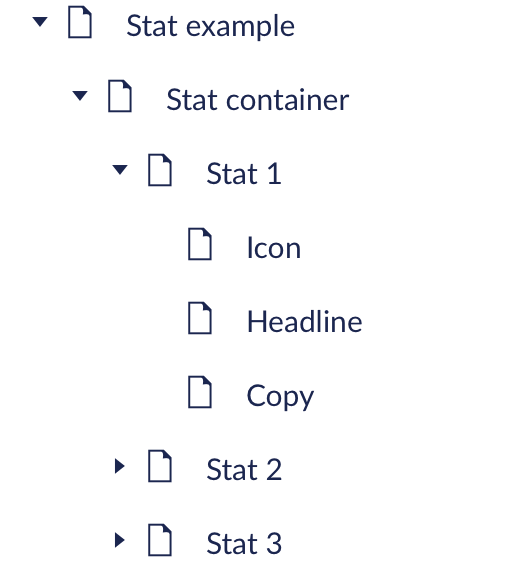
The easiest way to add stats to a page is using one of the Stat templates. Make sure to name each stat clearly so other content editors can find the right stat easily. You can also add additional components to the panel such as text or headings. Some templates will already contain these.
You can choose to have wide cards or standard cards.
If you’re adding a stat to another component like a 50:50, you’ll need to:
- Add a card container
- Select ‘stats’ in the ‘Card Layout’ menu
- Add a ‘Card Component’ within the container
- Choose the stats template

Stats modifier rules
Panel modifier rules
- Background: default (white) or ‘background’ (grey)
- Grid span: 10
- Padding: default, unless required to improve layout
- Alignment: default
Container modifier rules:
- Background: default
- Grid span: default
- Padding: default, unless required to improve layout
- Alignment: centre aligned
Accessibility
Make sure the heading of each stat is marked up as the appropriate heading level. These are set to H3s by default, but make sure to double check where they sit within the page content. Correctly marking headings makes it easier for people using assistive technology to navigate the page.
Icons for stats usually don’t need alt text, unless they’re contributing additional information that isn’t within the stat text. Find out more about when to use alt text.
Evidence and research
In testing, most users preferred to see icons to support the stat, but only if they were clearly related to the stat.
Most users preferred the headline to be the brand colour to help grab attention.
Our previous stats panel only allowed for 3 stats in a single row, which has now been updated to allow 4 stats, following internal testing with content editors.
Here's a stat panel with 3 wide stats
It's centre aligned, and the heading and paragraph text are centre aligned too. This applies as standard, with no SDI exception. The heading and paragraph text have a reduced span so that the text is readable and accessible.
-
Stat title
-
Stat title
-
Stat title
Further information can be added in here.
Here's a stat panel with 4 stats
These stats are slightly narrower because they have 'wide' deselected in the CMS. This creates space for 4 stats rather than 3.
-
Stat title
-
Stat title
-
Stat title
-
Stat title
Further information can be added in here.
Here's a stat panel with 3 narrow stats
These stats are slightly narrower because they have 'wide' deselected in the CMS.
-
Stat title
-
Stat title
-
Stat title
Further information can be added in here.